UI/UX Design | Merge Internship
MY ROLE
Product Design Intern
June – August 2021
San Francisco, CA
TEAM
Simeon Lee | Founding Designer at Merge
Tara Pichumani | Platform (formerly Growth and Product)
Henry Baer | Founding Engineer at Merge
Prannoiy Chandran | Growth and Product
AT A GLANCE
Merge is the leading startup in the unified API (application programming interface) space, offering integrations for HR, payroll, and recruiting systems. During my 10-week internship, I worked on a range of larger projects (such as the new CMS administrative portal) and smaller features on the landing page, documentation page, and web app interface. Here, I will highlight a select portion of my work, including:
For an in-depth summary of my Merge experience, check out my Medium article!
*UPDATE: due to my non-disclosure agreement, I am unable to share more information surrounding the work that I did on Merge’s admin portal, which was the largest project that I completed during this internship. Thank you for your understanding.*
DOCUMENTATION PAGE AND FOOTER
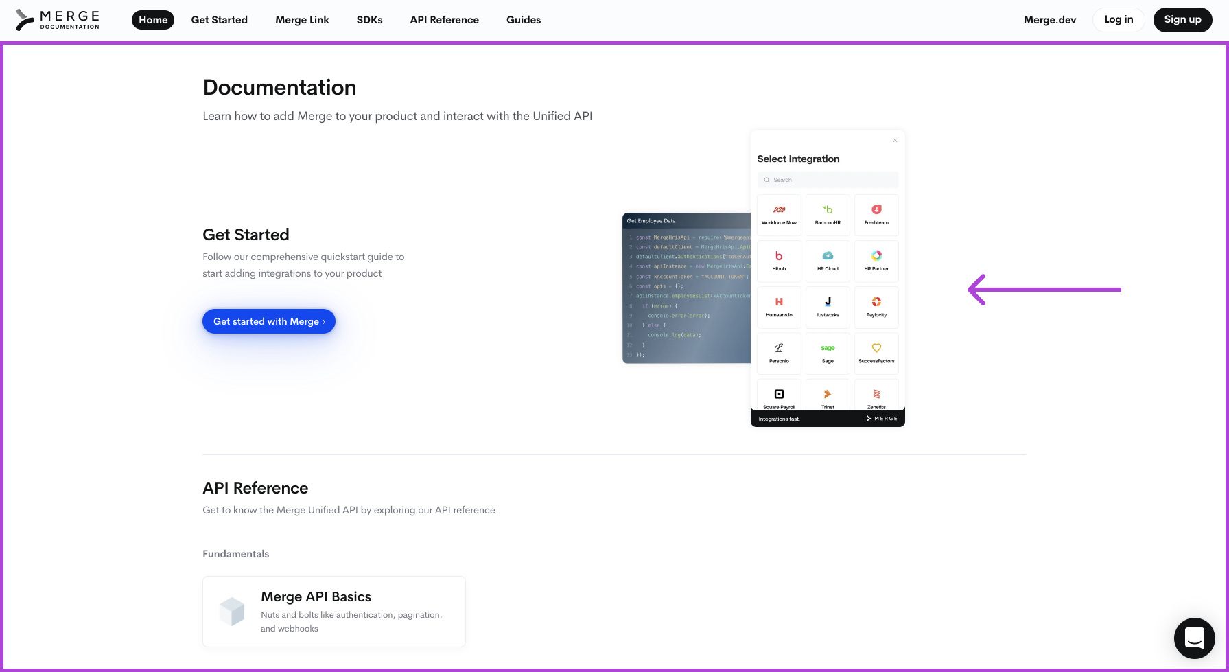
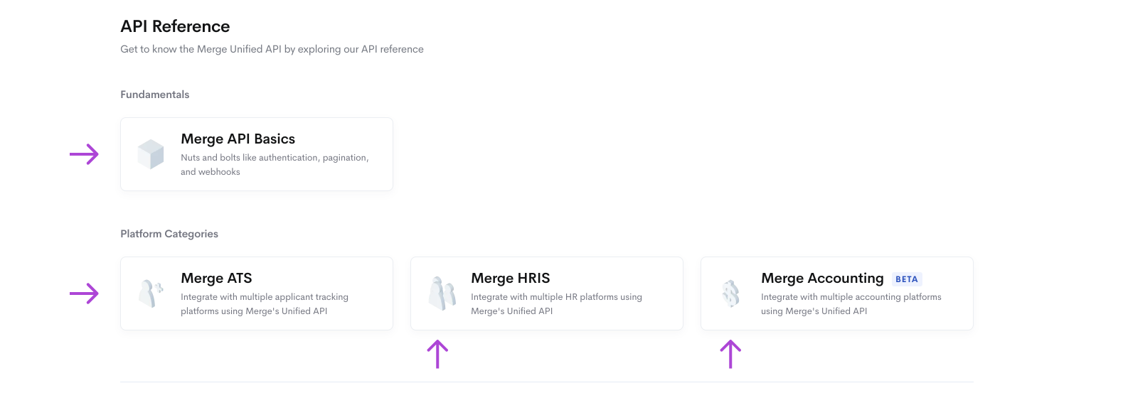
Excluding the header, I designed the body of the documentation home page shown in the purple box below. I also created the graphics shown next to the “Get Started” section, as well as the 3D isometric icons (shown next to “Merge API Basics”). The goal was to have a quick and easy starting point for new users while also offering in-depth guides for more advanced users.
Besides the documentation home page, I designed a new tab dedicated to guides, which would allow our developers to publish in-depth summaries about working with Merge’s unified API. I emphasized the “Get Started” section with the two guides that clients are most likely to visit first: “Add Merge Link to your frontend” and “Add Merge’s SDK to your backend.” On the right side, I included other guides on niche topics for more experienced users.
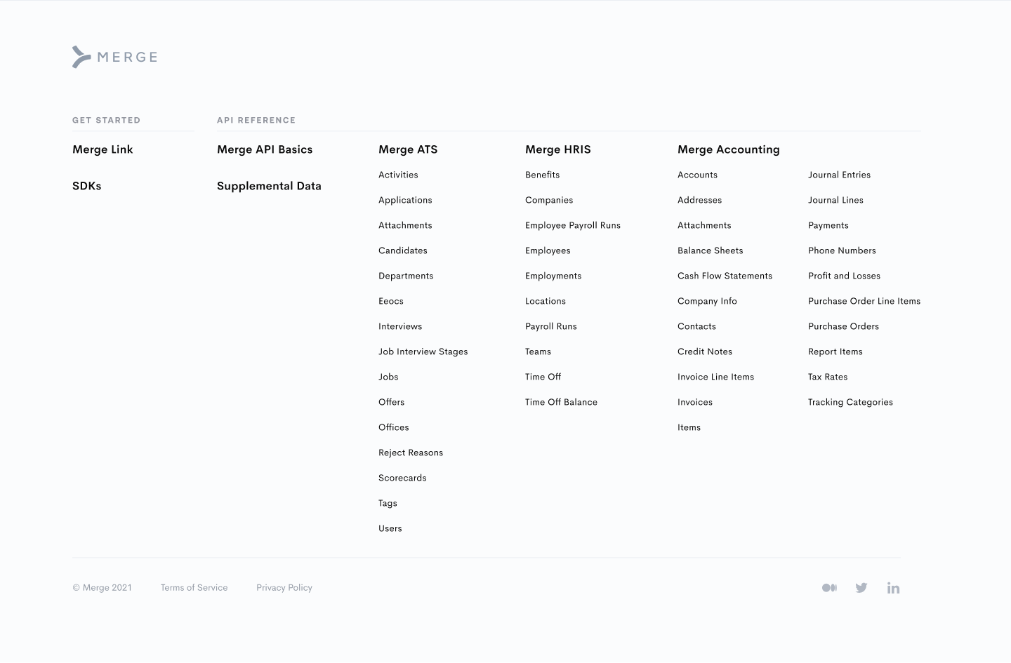
Additionally, I designed the documentation page footer from scratch (shown below). We wanted the footer of the documentation page to include a thorough list of all of the topics covered on the documentation page. Similar to the existing footer on our main landing page, I organized the footer into easily distinguishable categories. However, I completely changed the colors to match the lighter, airier feel of our documentation page.
LANDING PAGE DROPDOWN MENUS
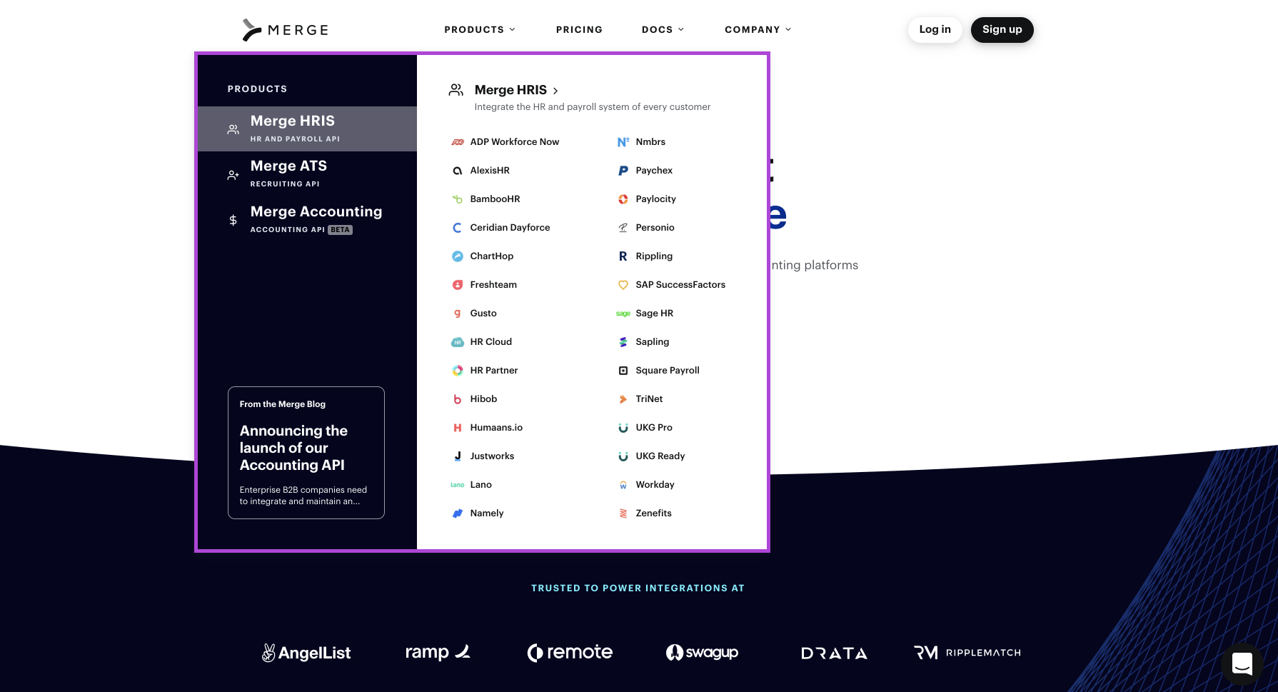
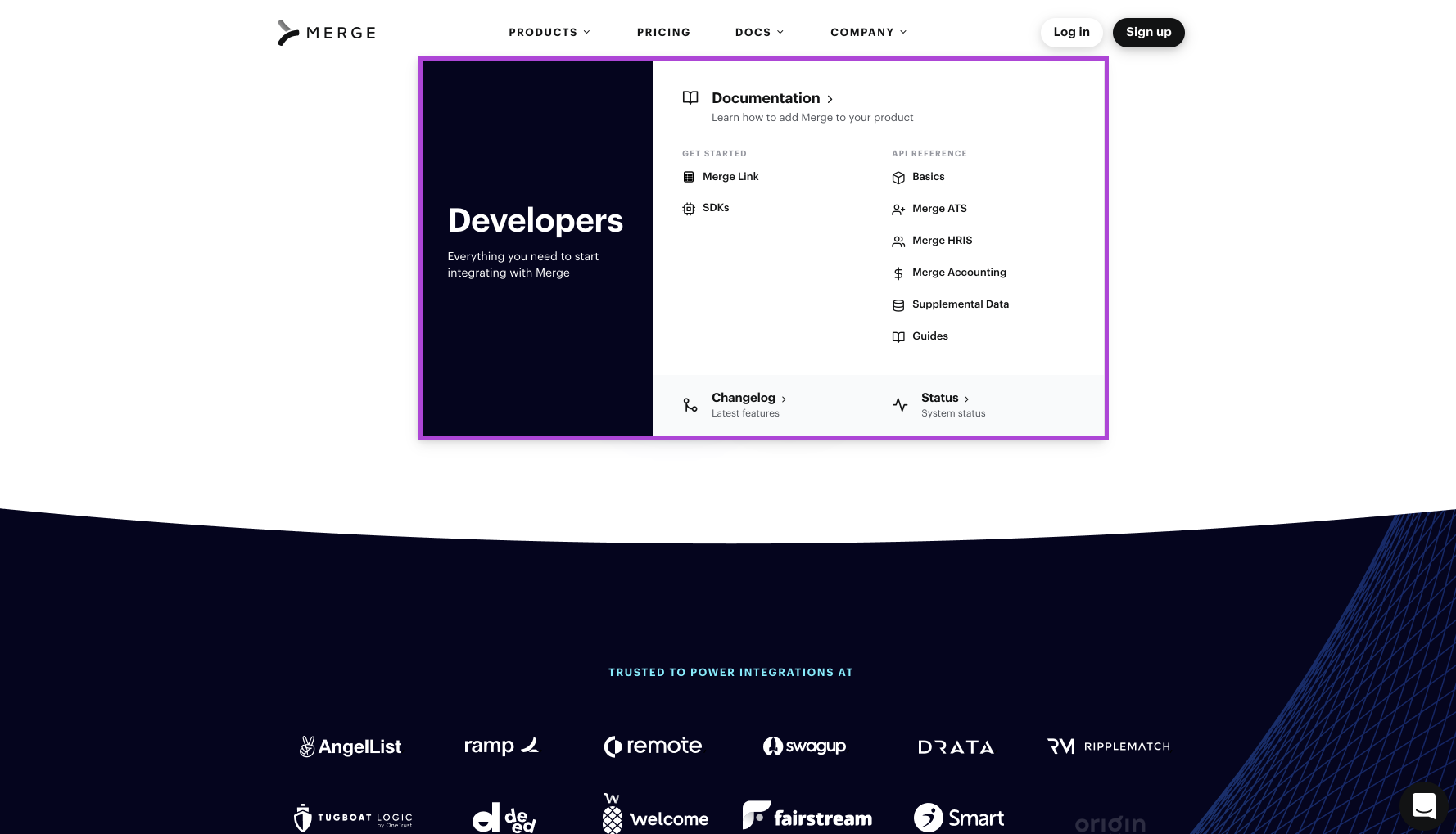
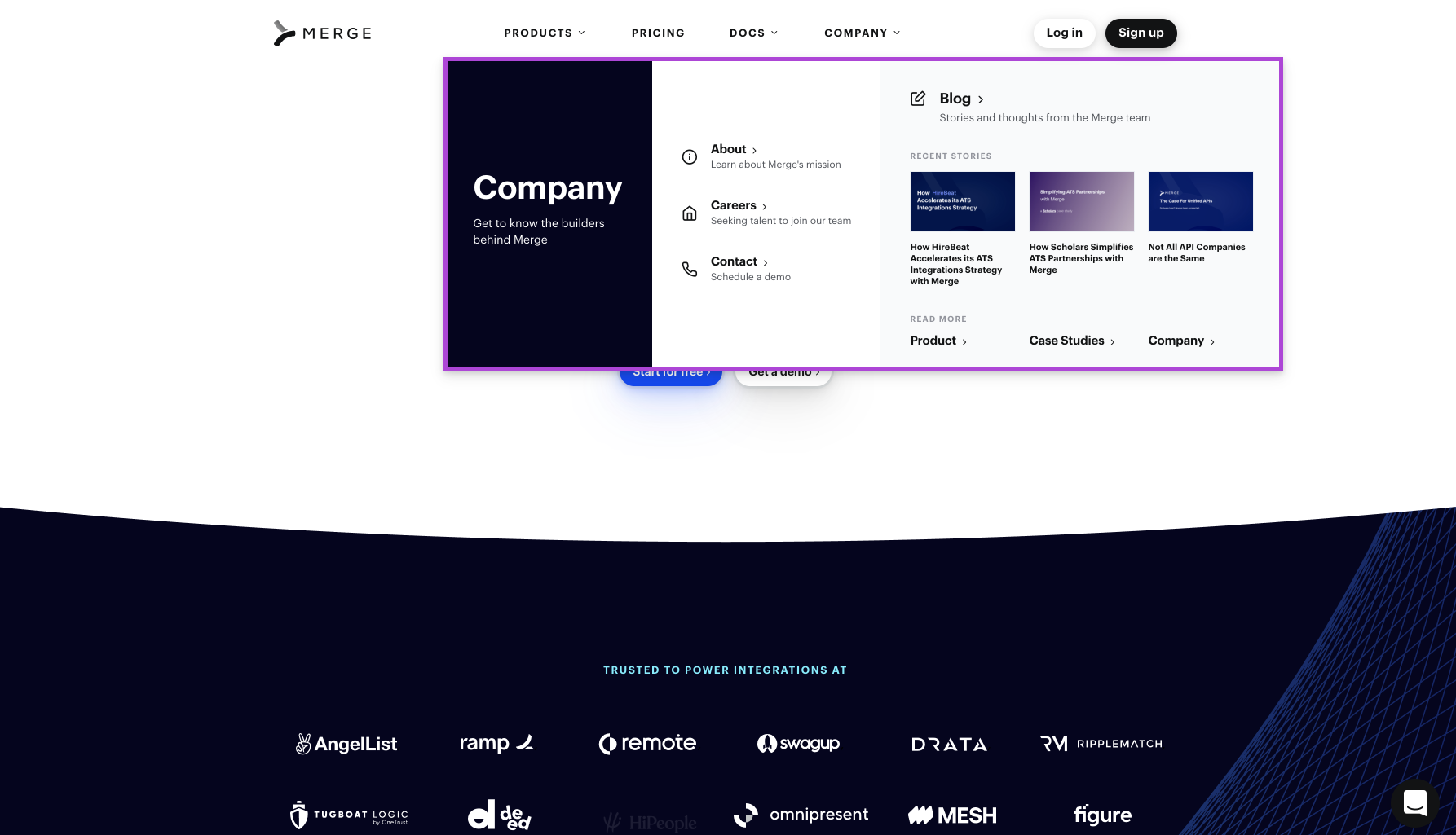
I redesigned the landing page dropdown menus for three tabs: “Products,” “Docs,” and “Company” (highlighted in purple). The goal was to make the dropdown menus look more visually appealing and allow for easier navigation of the site.

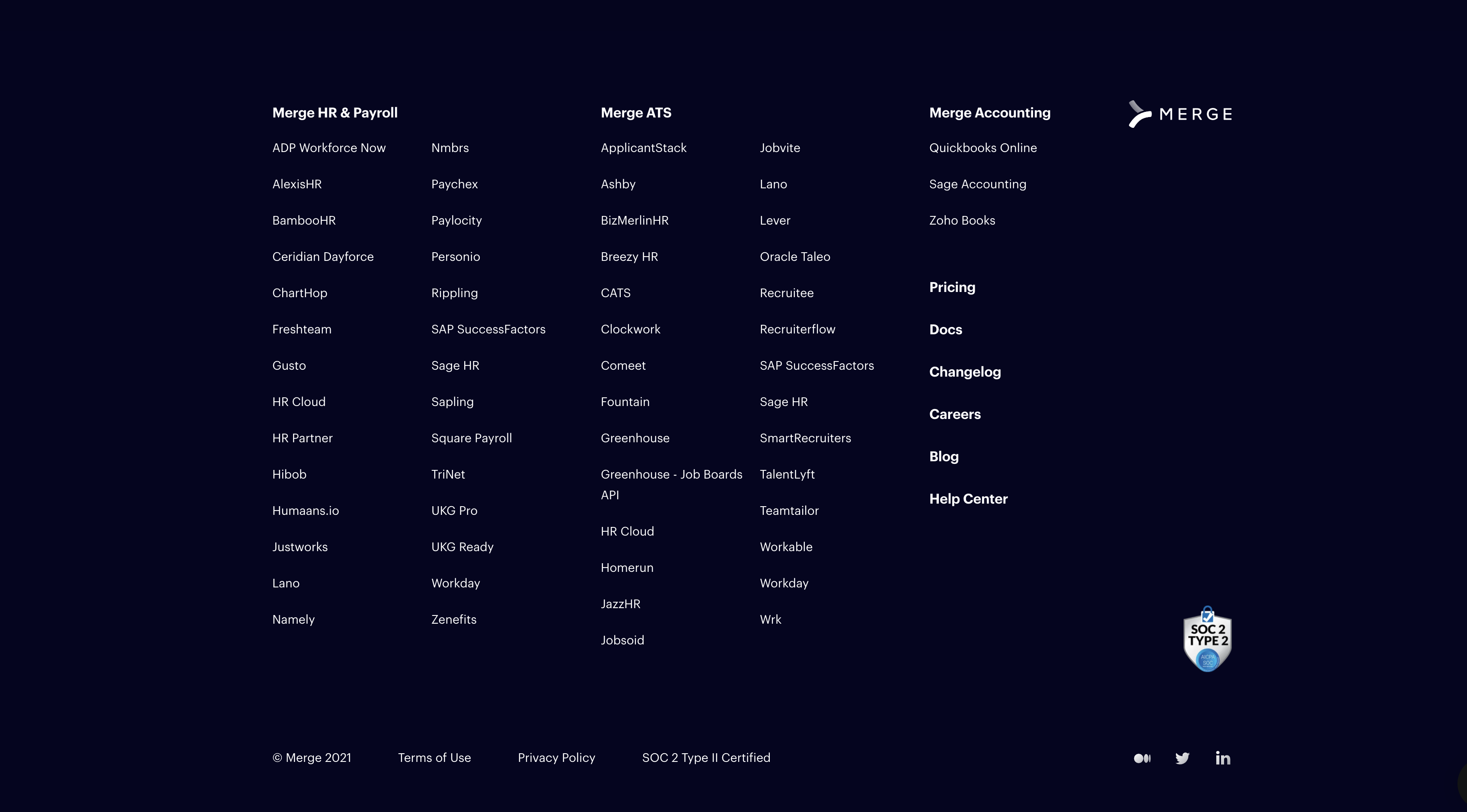
For reference, the previous landing page dropdown menus looked very similar to the footer shown below, a dark box containing a list of each integration within the HRIS, ATS, and Accounting categories.
3D ILLUSTRATION WORK
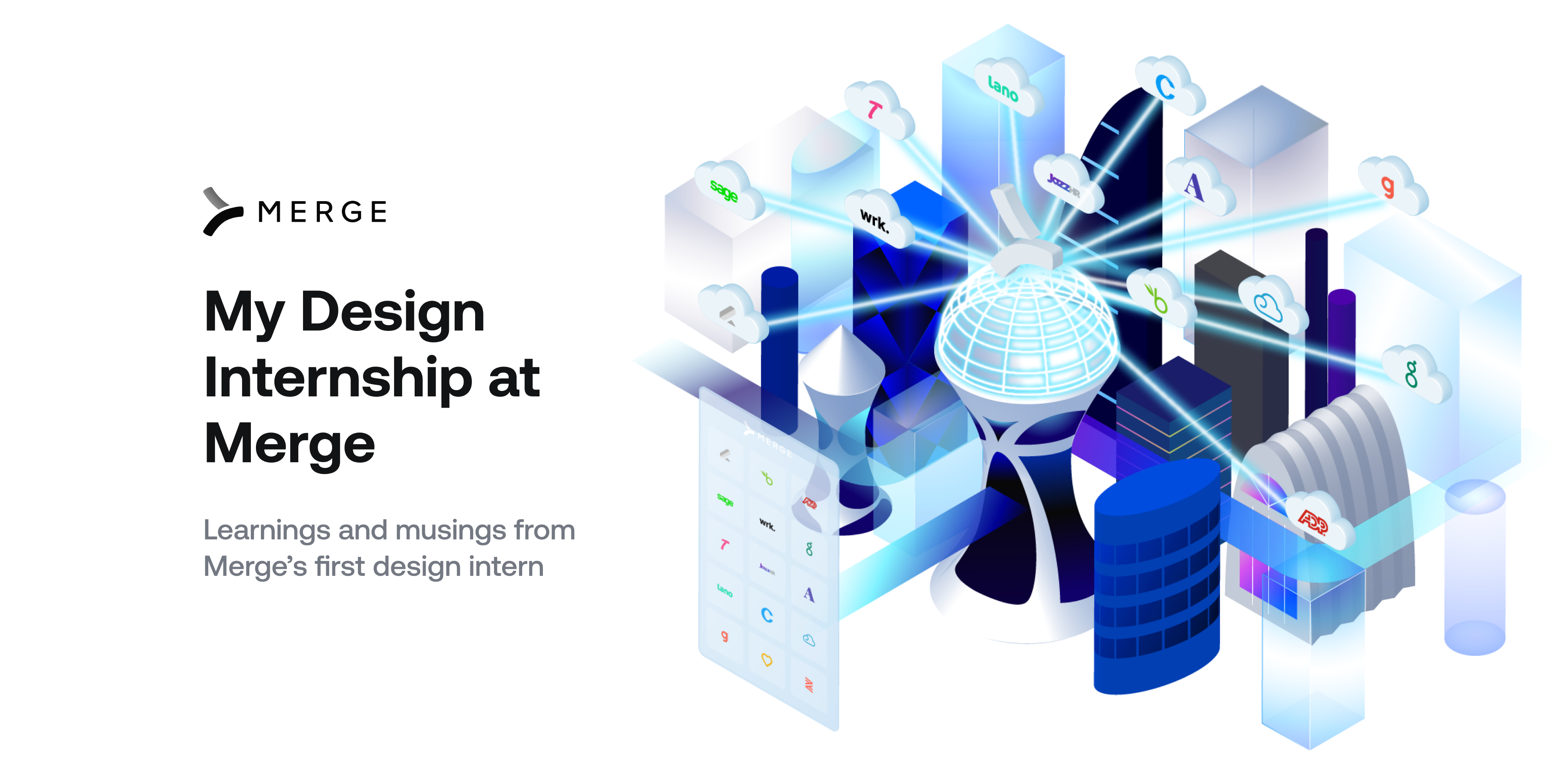
One of my final tasks was creating a 3D isometric illustration to symbolize how our product functions: Merge’s unified API powers integrations for our clients, who only need to integrate once with us. I created this using Adobe Illustrator.

FINALLY, THE MERGE SLACKMOJI GIF 🙂
This was something that I made just for fun. Thankfully, the other Merge employees loved it! It is now the most popular GIF in the Slack.
