UI/UX Design | Visa Internship

MY ROLE

Product Design Intern

June – September 2022

San Francisco, CA

TEAM

Raj Shriwas | Senior Staff Design Manager

Megan Mead | Senior Designer

Jenn Andrades | Senior Designer

Liz Benefiel | Senior Design Researcher

AT A GLANCE

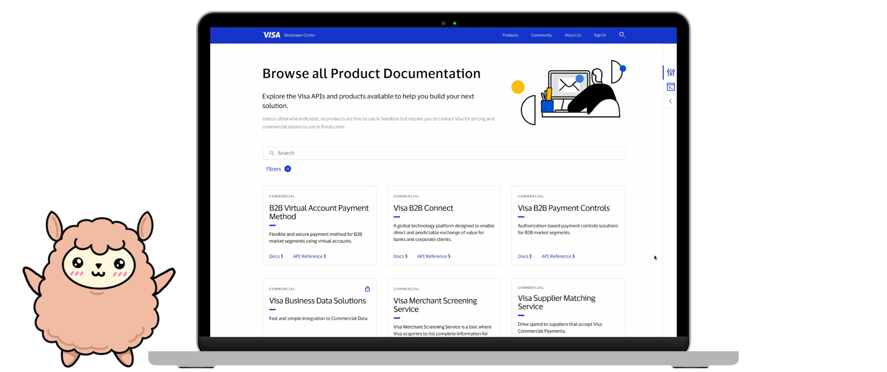
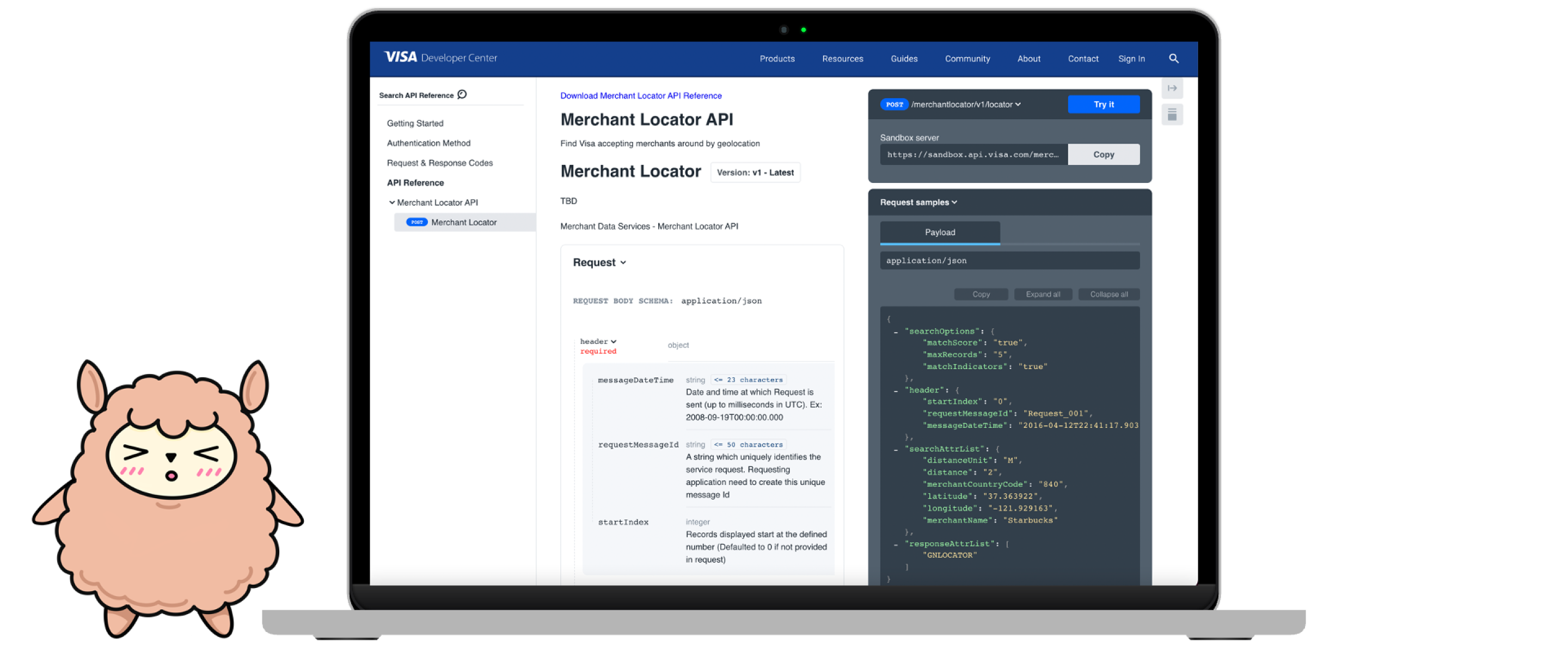
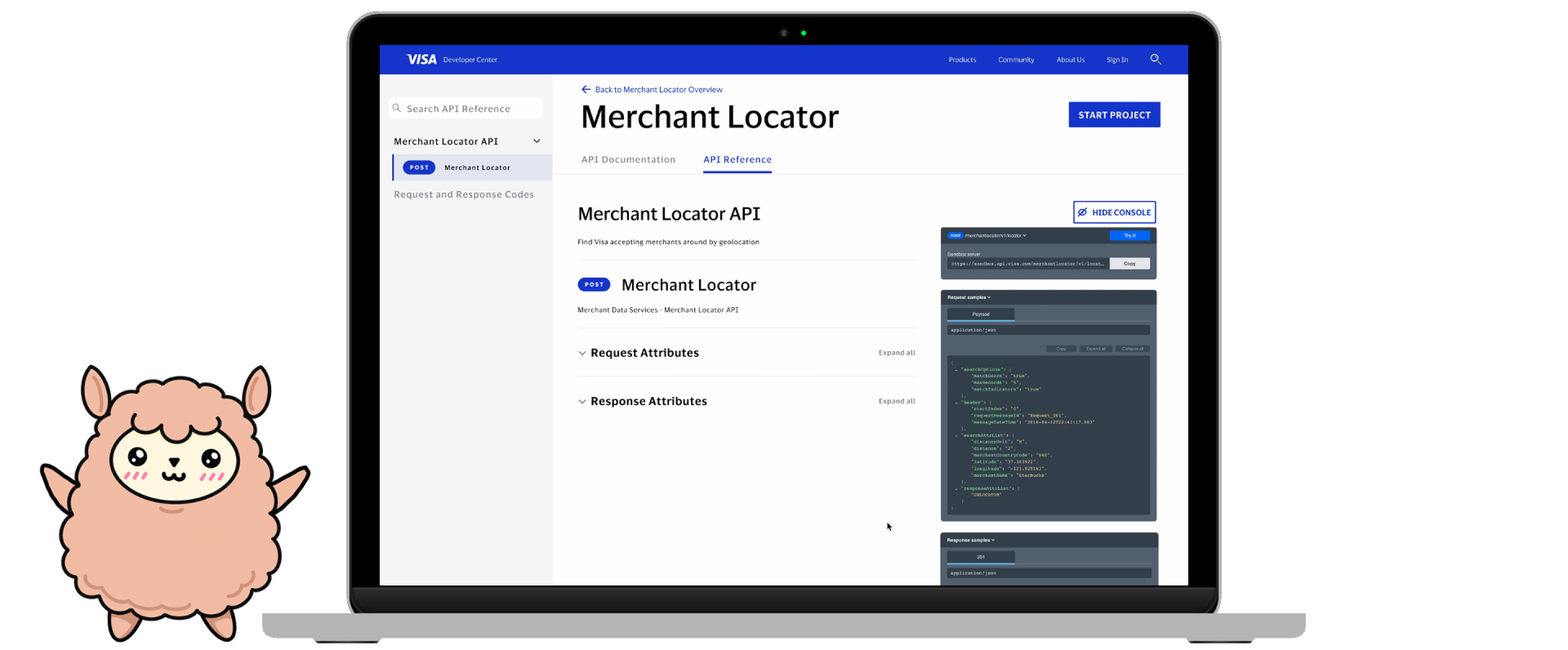
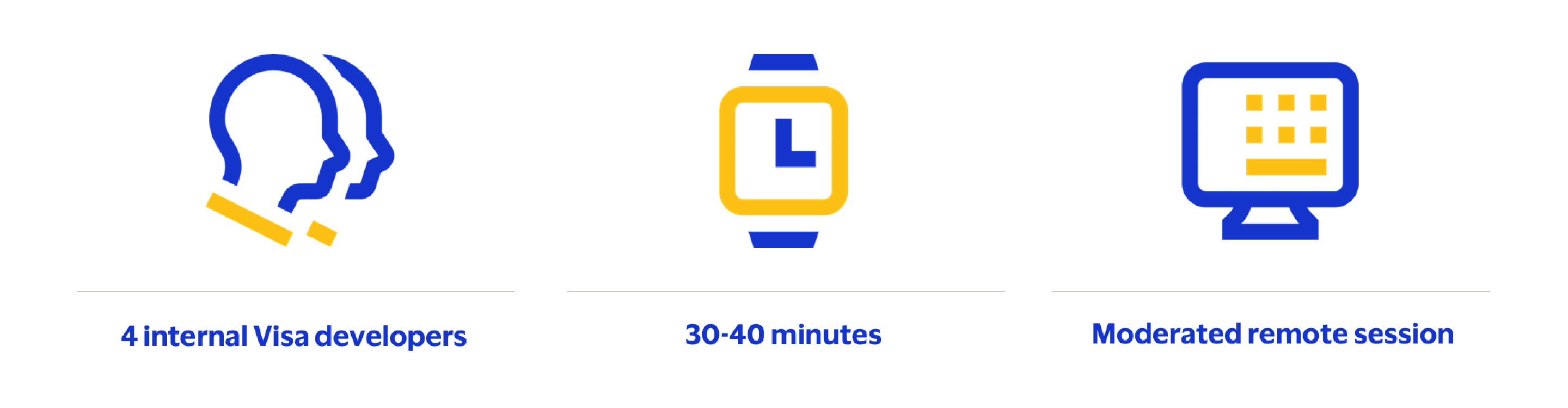
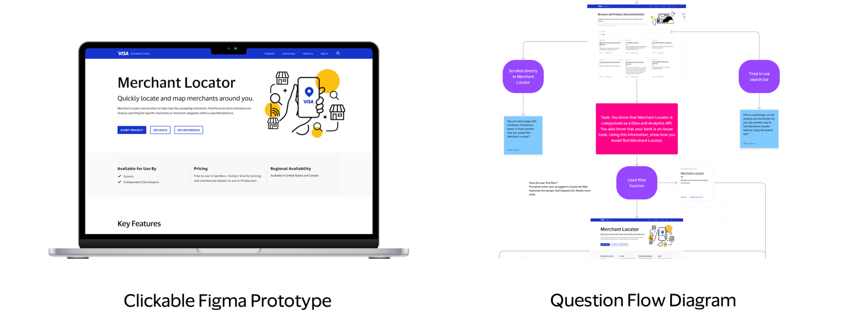
This summer, I redesigned the Visa Developer Platform experience to make it more intuitive, delightful, and aligned with the Visa brand purpose. Over 12 weeks, I researched and ideated with wireframe sketches, crafted low-fidelity and high-fidelity prototypes, hosted countless design review sessions, and conducted user testing on my designs with developers! 

Additionally, I had the opportunity to travel to the Austin office (yeehaw!) to attend the Visa Developer Dashboard workshops. There, I learned more about the payments API space than I ever imagined. I took notes, of course.

Lastly, I participated in the Consult for Change intern competition, where my team developed a new branding and marketing campaign for a non-profit called The Midwest Innocence Project. I am proud to say that my team won! Shout out to my teammates: Ashley Slocum, Evan Lovanio, Alison Wu, and Debleena Chatterjee!

CONTEXT

Why was this project important?

Visually Align with New Branding

Visa was in the process of transitioning to a completely new set of brand guidelines.

Improve User Experience

Previous usability testing conducted on the VDP website revealed issues with the navigability, information hierarchy, and content of the site, especially product overview pages, documentation pages, and API reference pages.

RESEARCH AND IDEATION

I began by exploring the Visa Developer website to see how it was currently structured. Of course, I had a lot of questions at this stage: what is the relationship between Visa Developer and Visa Partner? What is the difference between an API, a product, and a product family? Why might a developer come to VDP versus a product manager?

In fact, a personal goal of mine was to truly understand the Visa brand guidelines, portals, and products in order to build a knowledge base that would help me execute my project. Thanks to my manager and teammates, I quickly got the hang of all the Visa jargon and the content on the VDP website.

I took advantage of my unfamiliarity with the site to critique the current user experience and design (fresh eyes, am I right?). Additionally, I consulted previous research conducted on the user experience of the site to identify further pain points. Afterward, I created these quick wireframe sketches to capture my ideas.

LO-FI & HI-FI PROTOTYPING

It turns out that sketching helped me solidify the ideas and critiques that were brewing in my head.

For example, on the “Browse All Products” page, I noticed that users cannot directly access the API Reference page from each product card. Despite the filters on the left-hand navigation bar, it was difficult to find or search for a product. 

In my designs, I created a more prominent search bar, the ability to access API Documentation and API Reference directly from each product card. A more experimental design feature was placing the filters and sort function into a right-hand panel component that expands and collapses (inspired by a component that I saw in the Visa Product Design System). This got mixed reviews from actual developers–but more on that later!

Next, I tried to tackle the API Reference page. As soon as you come onto the page, you see all these cascading boxes and different fonts in different sizes and colors….QUITE overwhelming to say the least. 

My mantra when redesigning this page? Keep it simple. I played around with a collapsible/expandable tree diagram structure to clearly show the parent and child attributes without cluttering the page. One concern here was the number of user clicks, but the “Expand All” and “Collapse All” buttons resolve this issue. In addition to the left-hand navigation bar, I added a top navigation bar to easily toggle between API Docs and API Reference. 

DESIGN REVIEW

Throughout my internship, I scheduled weekly, 1 hour-long design review sessions with my teammates. I am eternally grateful for them, especially on the visual front, because I learned so much about using imagery and color in a meaningful way, all while navigating the ambiguity of transitioning to new brand guidelines.

For example, on the Merchant Locator Overview Page, I created some simple line illustrations to convey the function of the product. 

Similarly, on the VDP Home Page, I worked with blocks of color to separate information and balanced illustrations with cut-out photography for a fresh, open feel.

USER TESTING

I had never done user testing before, so I was very excited to work with Liz Benefiel, our design researcher! We conducted user testing with 4 internal Visa developers with varying experience levels with APIs, each for about 30-45 min on a moderated Teams video call.

To prepare for my user testing, I created a clickable Figma prototype and a question flow diagram to help me anticipate what users might say or do.

USER FEEDBACK

I loved being able to moderate the user testing sessions and get immediate feedback on my designs from the developers!

Constructive

  • Right-hand filter component is hard to find; users prefer to search or scroll
  • Minor content changes on the Merchant Locator Overview Page
  • Questions on how search works for API Docs and API Reference

Positive

  • Liked collapsible/expandable tree diagram on API Reference Page
  • Liked ability to toggle between API Docs and API Reference
  • Designs felt “clean,” “simple,” and “very on-brand with Visa”

FINAL PROTOTYPE

Voila the final prototype!

KEY TAKEAWAYS

  • I learned how to design aesthetically within the realm of a functional and information-heavy platform such as VDP.
  • I learned the importance of keeping users in mind at all times, especially when working with the API Docs and API Reference pages.
  • I learned that design is about telling a cohesive story–not just throwing images and UI elements on a page and hoping that it looks good!

CONCLUSION

Overall, I had a wonderful experience at Visa thanks to the warmth, patience, and support of my colleagues! Special thanks to my manager, Raj, my teammates Megan and Jenn, my design research role model Liz, my intern besties Ashley Yoo and Evan Siu, and the rest of the design org for making this summer so memorable! If I had one main takeaway, it would be this: there’s a lot more to Visa than just credit cards. *wink*